Bonjour my little demon,
Welcome to the edition #66 of The Art Missive. We are now 12,150 😈 in this newsletter! Whether you've been here from the start or just arrived, thank you so much for reading ❤.

If you haven't already, you can also:
Read all the previous Art Missives
Ask your questions for the next QaAs here
In this Missive:
1/ Blue.
2/ Concept.
3/ Result.
4/ Conclusion.
1/ Blue.
It's Tuesday afternoon. The sun beats against the window, bathing my studio in blinding light. A small canvas rests on my imposing wooden easel: new canvas, new beginnings.
Overwhelmed by the suffocating heat, I take a break from my research and find myself staring at the immaculate ceiling above. Billie Eilish's album, HIT ME HARD AND SOFT, has been playing for the past half hour, but in this precise moment, a particular lyric strikes me like a bolt of lightning on a summer night:
"Mm, mm, mm I try to live in black and white, but I'm so blue"
Suddenly, it feels as though divine inspiration has taken hold of me. I leap from my chair to stand in front of my easel, already well-stained with paint from previous work.
This feeling... I can paint it. I must paint it.
Welcome to edition #66 of The Art Missive, where I paint one of Billie Eilish's songs.
2/ Concept.
Billie Eilish's song BLUE (HIT ME HARD AND SOFT) struck a chord with me, but not necessarily because of the heartbreak she describes. What inspired me was one particular line:
"I try to live in black and white but I'm still blue".
It all comes down to this single sentence. And above all, it's about a very specific feeling:
the feeling of trying to fit in, to be successful, to improve yourself, but no matter how brightly the world around us shines, we find ourself lost in de shadows, as if an emptiness, a drive to overcome, anger or sadness was already taking up too much space to be filled with anything else.
A feeling of loneliness that even the vibrant hues of summer days can't soothe.
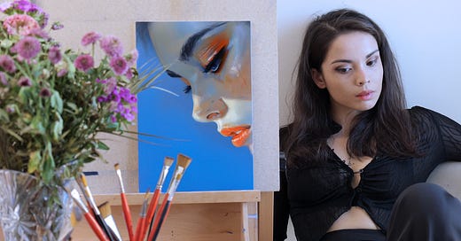
To capture this concept on canvas, I wanted to create a contrast between the essence of summer (the sun, vacations, lively gatherings) and the experience of "feeling blue". I achieved this firstly through a play of light and shadow: the face bathed in light, but the gaze lost in darkness. Additionally, I juxtaposed particularly warm colors, almost excessively so, with the character's cold, detached expression.
This painting also provided an opportunity for me to experiment with several new techniques:
First, I chose an unusually small format, with the canvas measuring only 22x33 cm, an intimate scale that allowed me to delve into the character's inner world.
Next, I aimed for a raw, expressive rendering, with bold brushstrokes and aggressive transitions.
Finally, for the first time, I employed a very warm color palette, dominated by greens and oranges—a drastic shift from my natural inclination towards cool blues, reds, and whites.
3/ The result.
I’m glad to announce to you that you’re the first to discover my second solo painting, "Feeling Blue."
The portrait depicts a young woman adorned in the vibrant colors of summer. At first glance, she appears to have everything she needs to be happy and fulfilled. Her radiant beauty seems to mirror the joyful energy of the season.
However, as the world around her celebrates the warm days and carefree vacations, a close-up of her gaze reveals a hidden truth. In that fleeting moment, unseen by others, the shadows in her eyes unveil the true hue of her emotions. It's as if something deeper, more profound, is causing her pain—a sorrow that even the cheerful month of July cannot soothe.
4/ Conclusion
Ultimately, the creative process behind "Feeling Blue" was a bit of a chaotic journey. There were moments of doubt, frustration, and even a few paint splatters that definitely weren't intentional (let's just call those happy accidents, shall we?).
But despite the messiness, having a clear emotional focus gave me a real sense of direction and motivation. It was like I was driven by something bigger than myself, a universal feeling that we can all relate to on some level.
And now, with two paintings completed, I have to say I'm quite proud of the results. You welcomed "The Color of Vengeance" with such enthusiasm that I'm considering turning one or both of these paintings into a limited edition print collection. And of course, you, my little demons, would get early access.
What do you think about that idea? I'd love to hear your thoughts!
Voilà, that's all from me.
Keep creating and see you next week! 😈
Léa


Well done, congratulations on another success!